

Originally a quick printing franchise in the 1980's, Oakridge Design + Print transformed into a full service design and printing solutions company, servicing clients as diverse as country clubs, tech start-ups and non-profit organizations throughout the San Jose area. Oakridge needed an updated look that reflected the high end design and printing work they were known for. The rebrand coincided with an updated website and in-store remodel.
As former Lead Designer of Oakridge Design+Print, I was fortunate to have the opportunity to rebrand the company from the ground up.
Main Logo
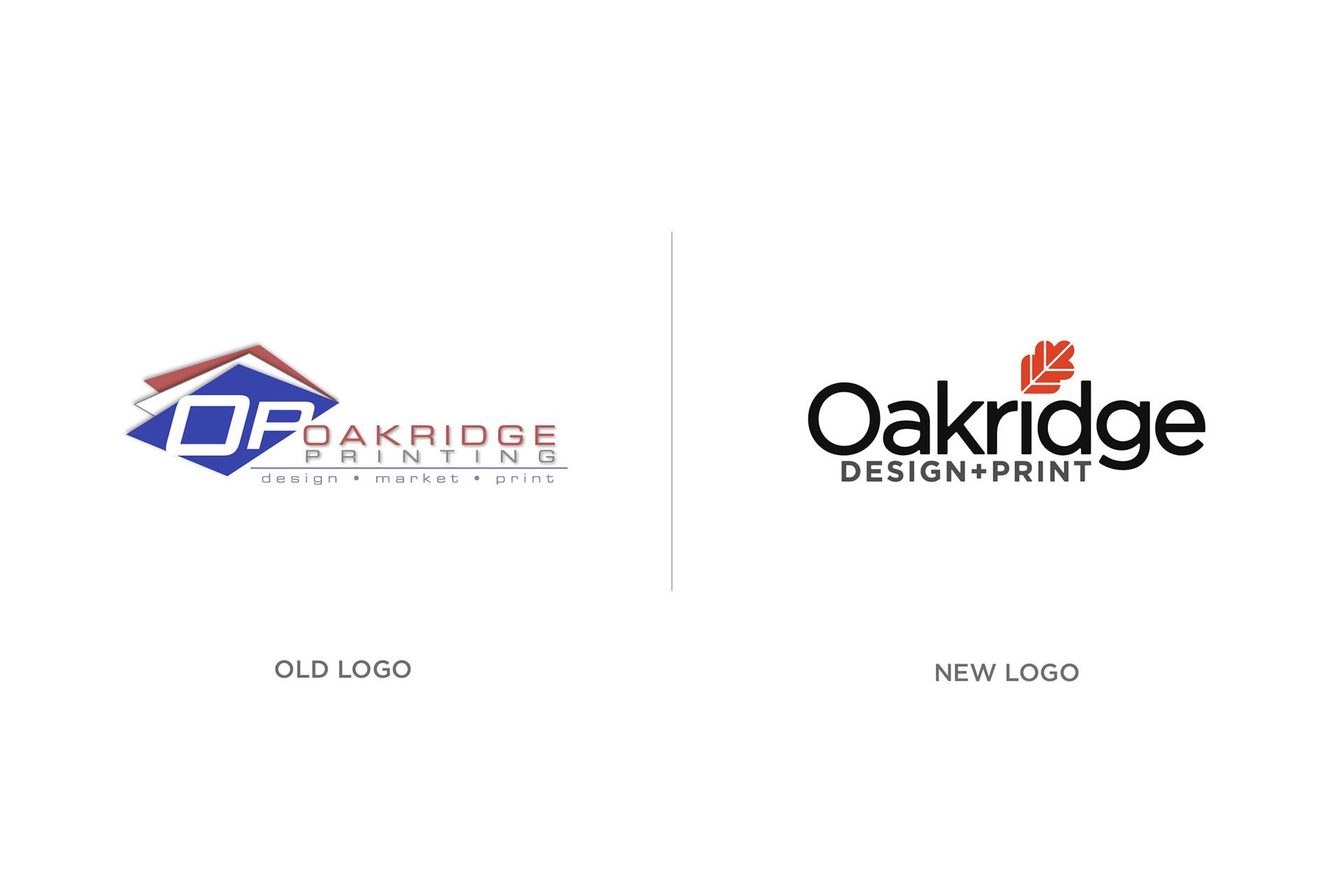
Old vs. New Logo
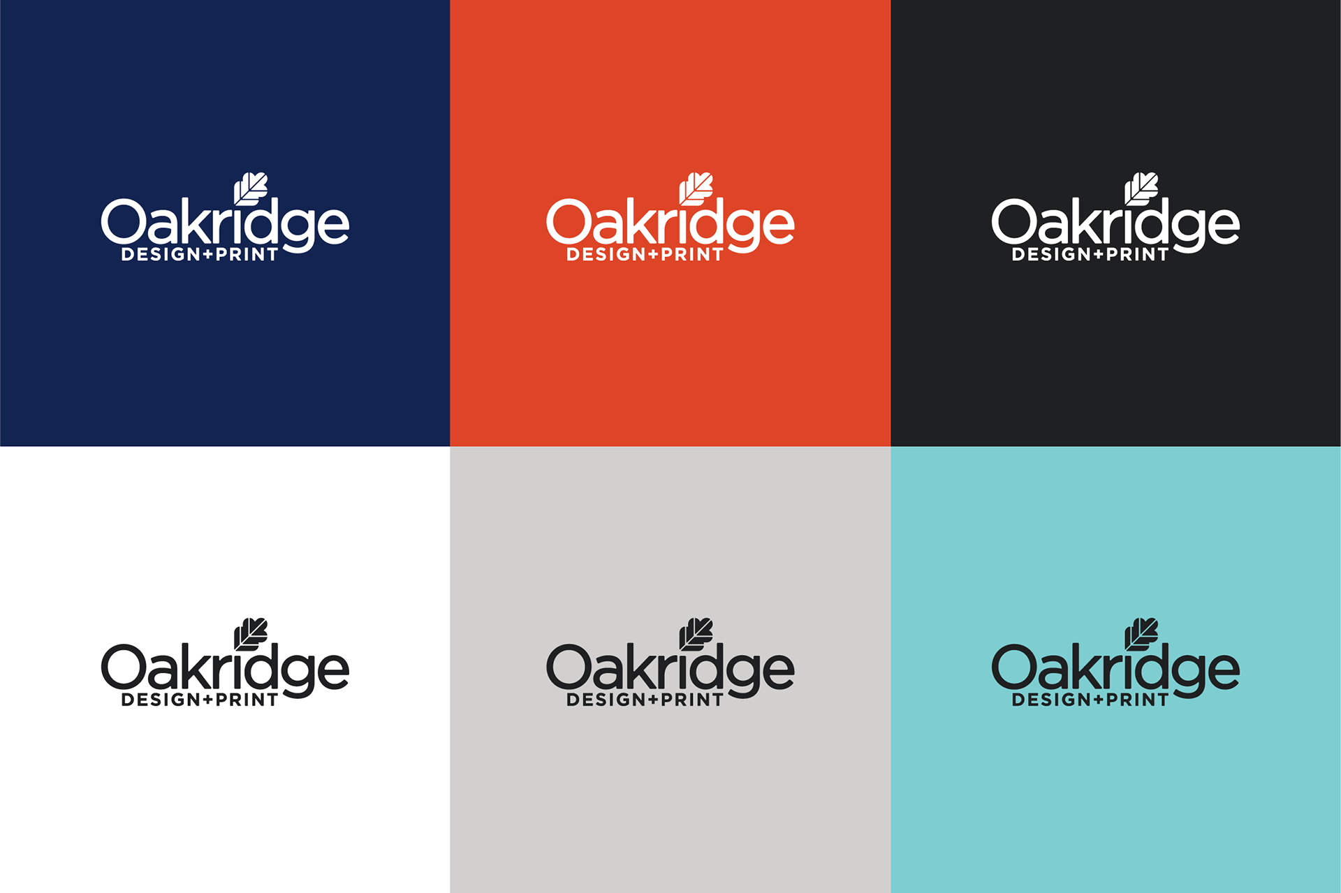
Logo Contrast
Eschewing the tradition of printing companies using CMYK/Process color schemes in their branding, I opted to us a modern, vibrant color palette of Warm Red, Navy and Aqua.
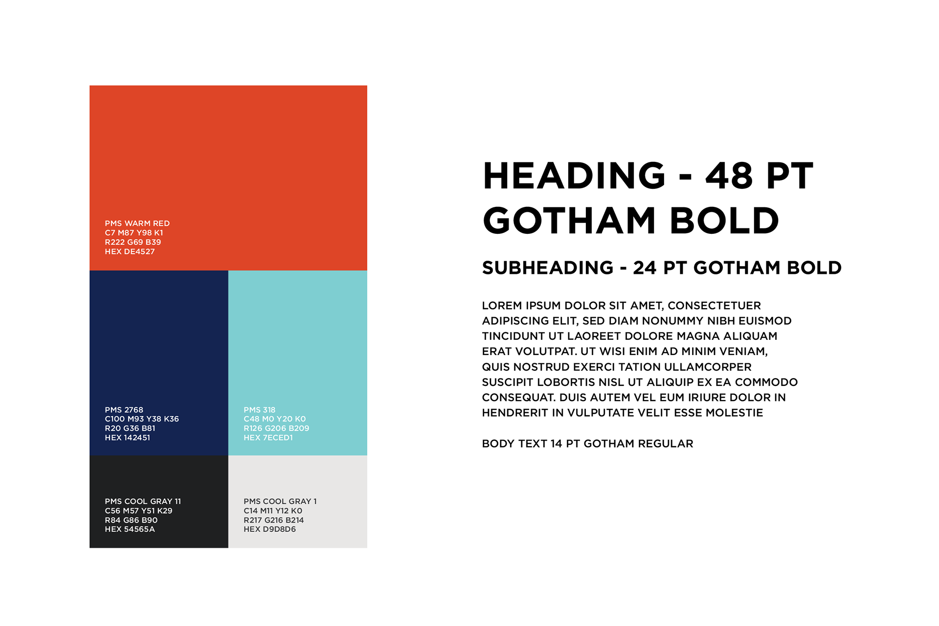
Brand Colors and Text guidelines

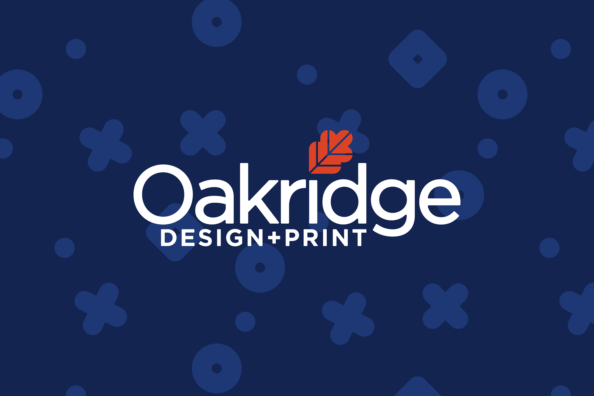
Background Patterns
Background patterns were used to create subtle texture and can be applied to any number of uses, from signage to printed collateral.

Window Decal

Instore Wall Signage
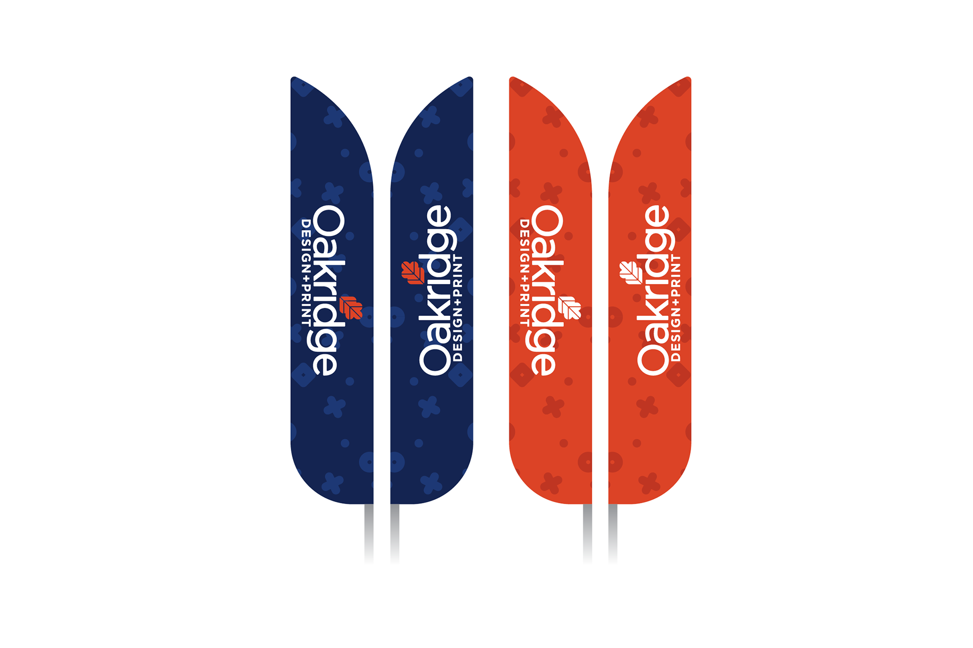
Outdoor Flags

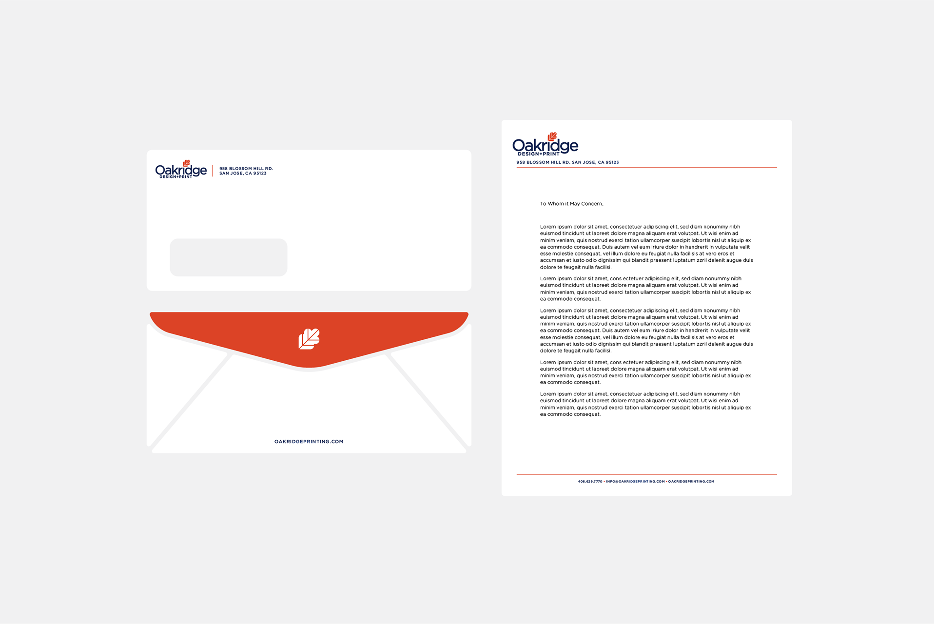
Rebranded Stationary Mock-up
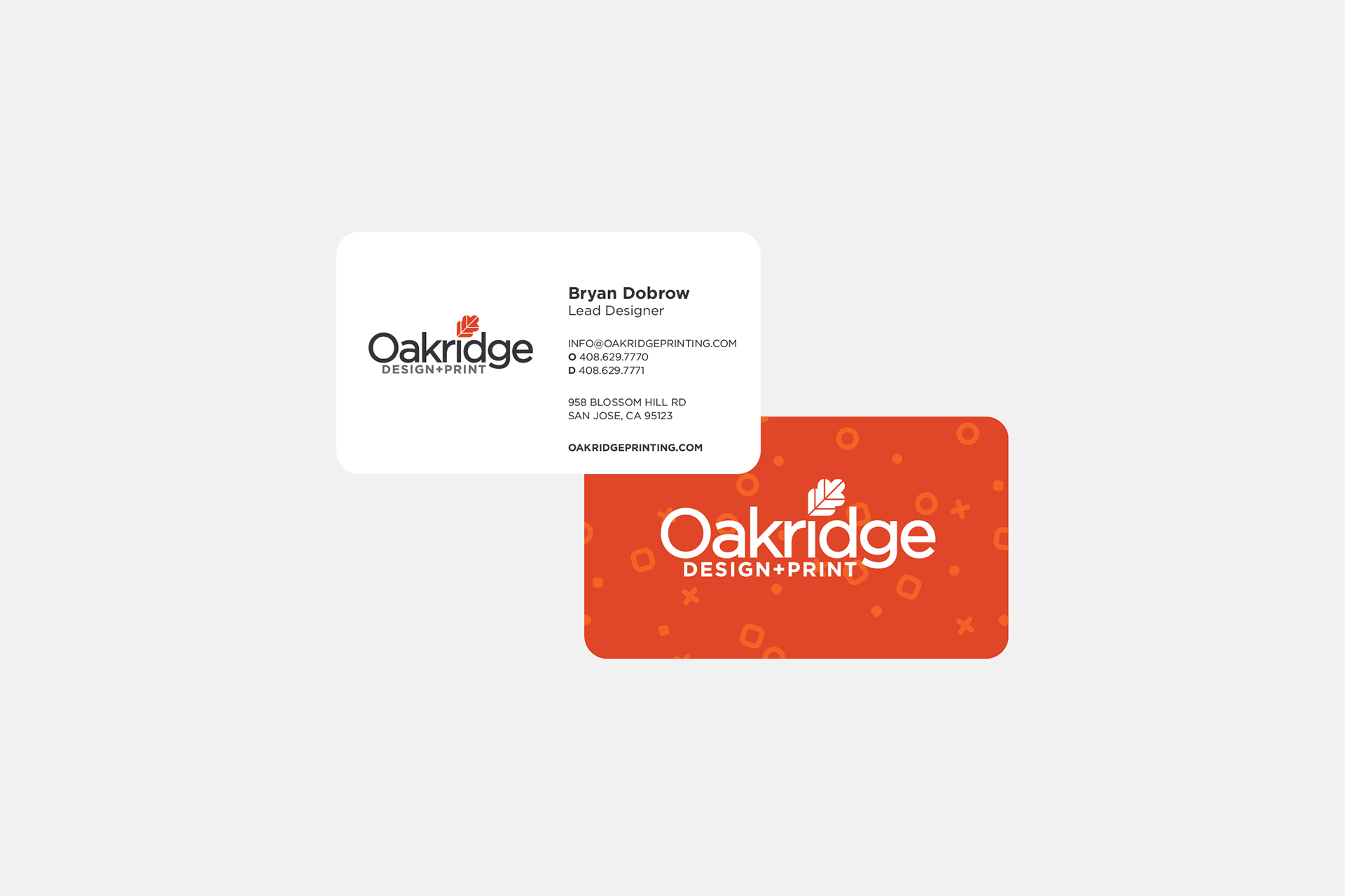
Rebranded Business Cards
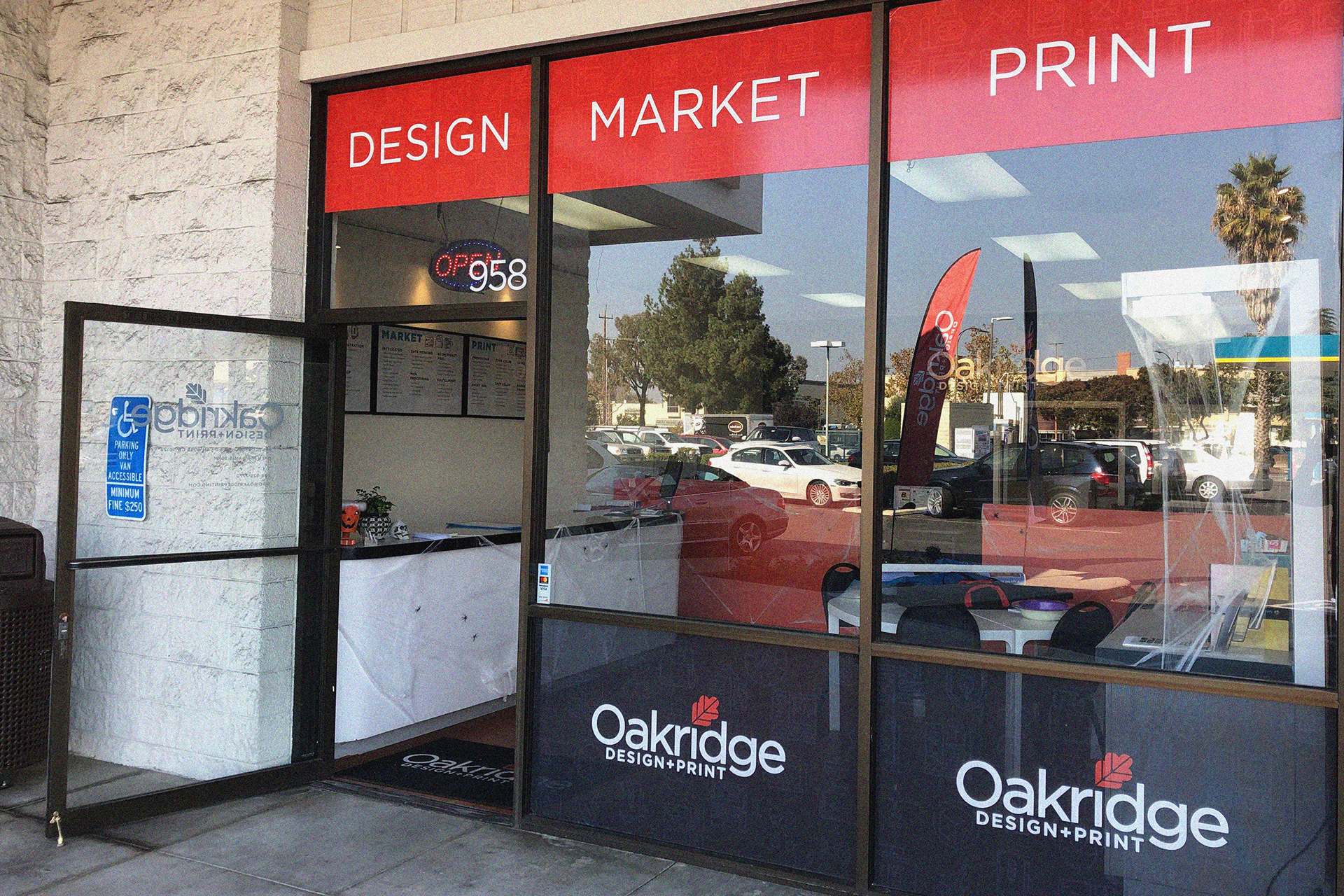
Yes, this shot was taken during Halloween.